In-Page AI Widget
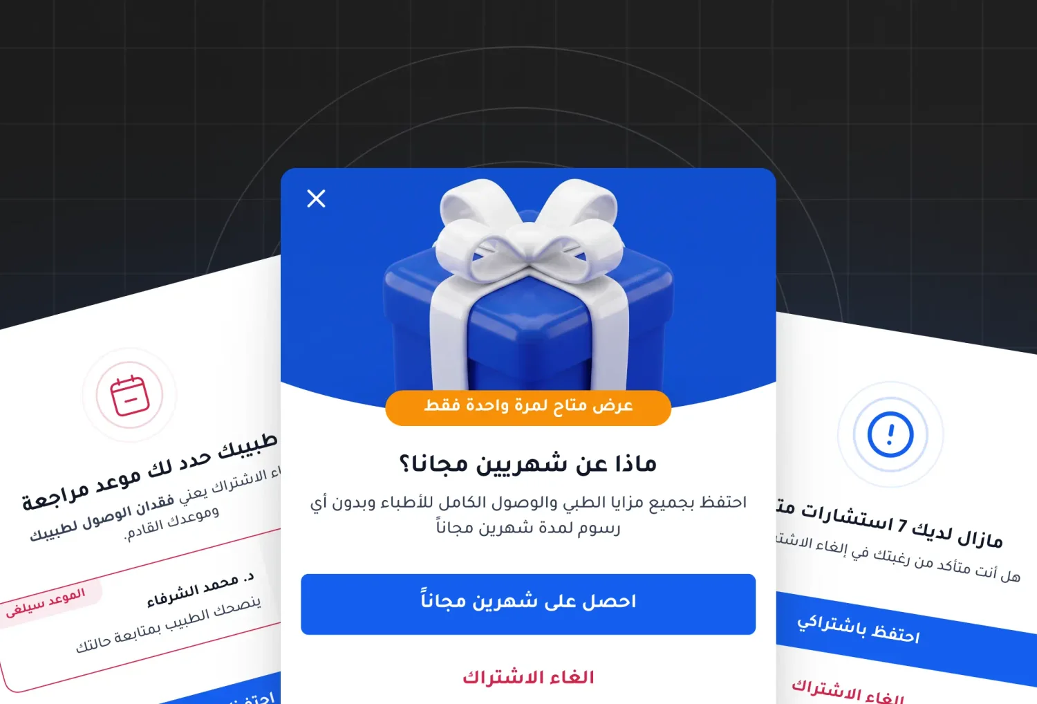
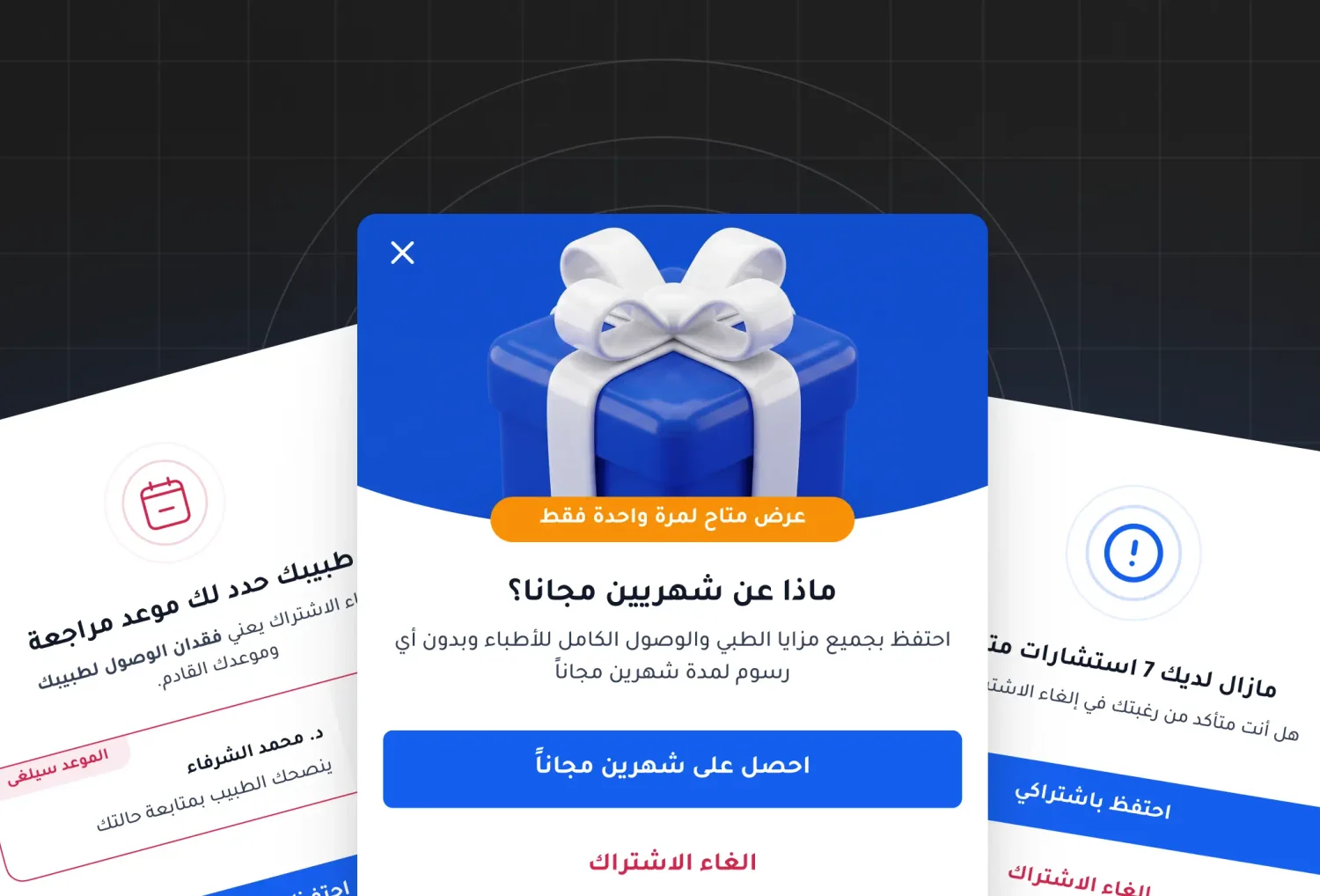
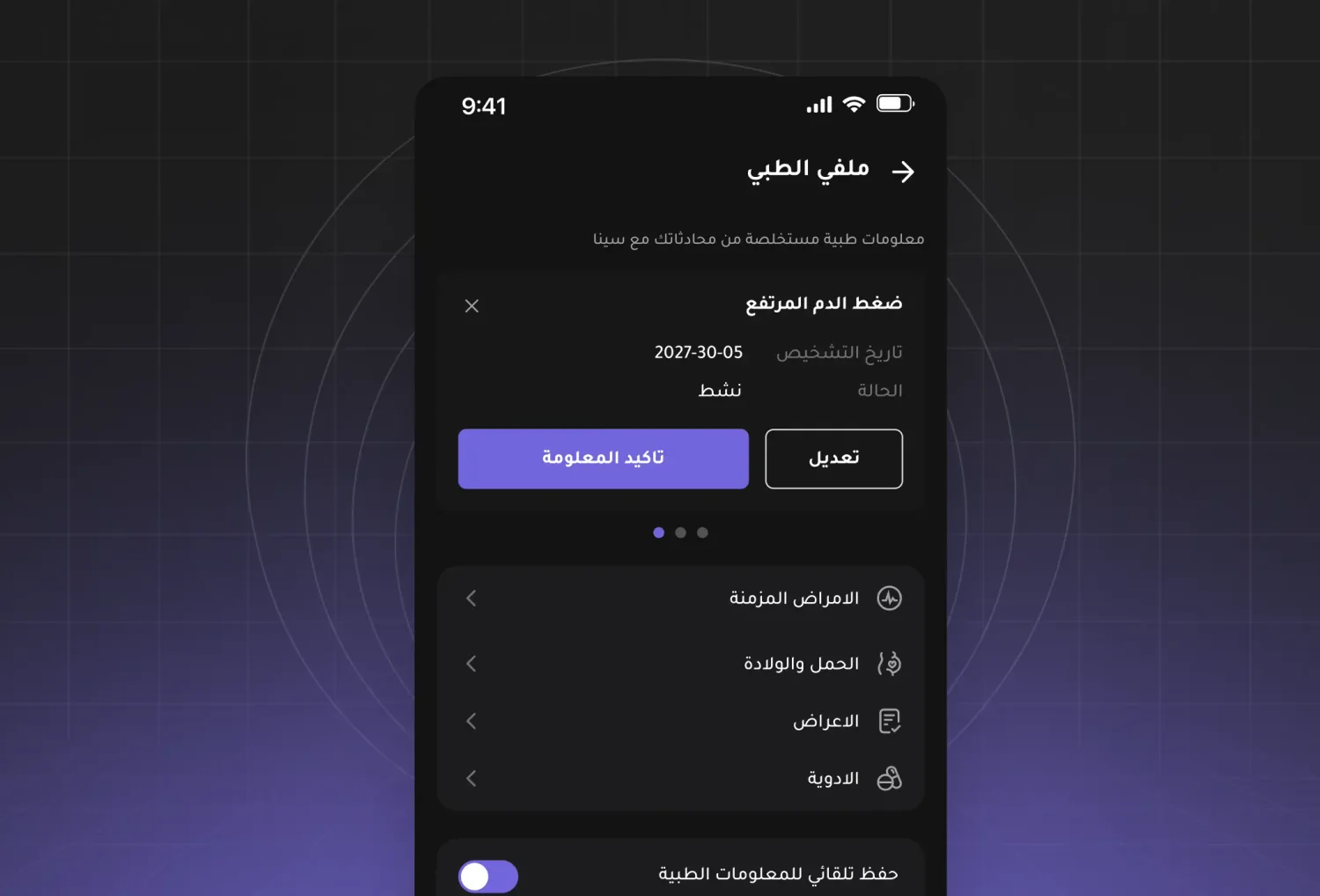
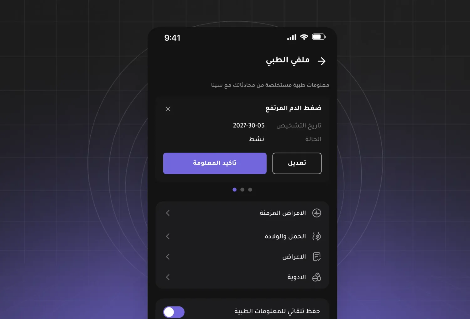
An AI entry point on Altibbi's website, rebuilt across three shipped versions — from a button that sent people away to a conversation that kept them, with a route to a real doctor.
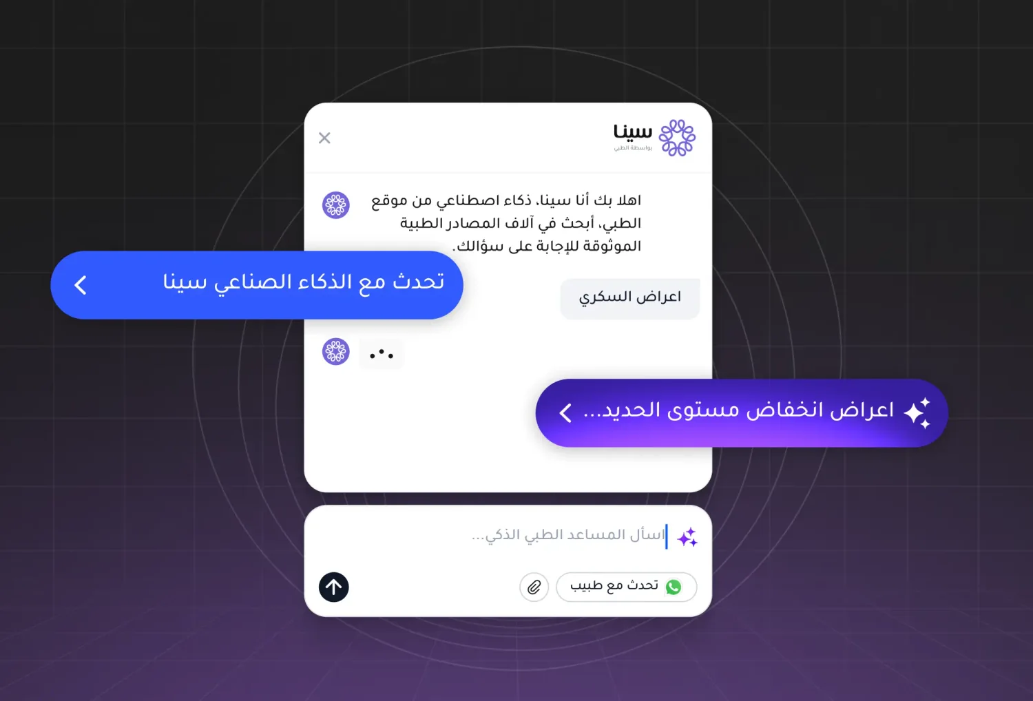
Altibbi's website gets millions of readers looking up symptoms, conditions and medications in Arabic. The AI entry point on those pages went through three shipped versions. This is what changed each time, and what the third one proved.
Role: Product designer — owned the widget across all three versions.
Context
Altibbi is the largest telehealth platform in MENA. Alongside the consultation product sits a large medical content library — the pages people land on from search when they're worried about something at 2am.
Sina is Altibbi's AI health assistant. The question this project kept asking: what should Sina be doing on a page someone is already reading?
Problem
The first version treated the article page as a waiting room.
A static widget sat on the page, and tapping it sent the user straight into Sina — a different surface, a blank conversation, no memory of the article they had just left. The user had to restate the thing they were already reading about.
We were interrupting the answer to offer an answer.
It also inherited the assumption underneath most AI features of that period: that the value lives in the chat product, and everything else is a corridor leading to it.
Version 1 — a door

Static widget, one tap, straight to Sina.
It worked as plumbing and failed as an experience. Nothing about it earned the tap. It asked the user to abandon the page they had chosen, on the promise that something better was elsewhere.
Version 2 — a door that knows where it stands

The widget began generating a tag from the content of the page it sat on — a short summary of the article underneath it.
This is the smallest change of the three and the most important. It is the first version that demonstrates something to the user before asking for anything: it has read this page, so it will probably understand my question about this page. Relevance became visible instead of promised.
The destination was still Sina. But the widget had stopped being generic furniture and started being about the article.
Version 3 — no door at all
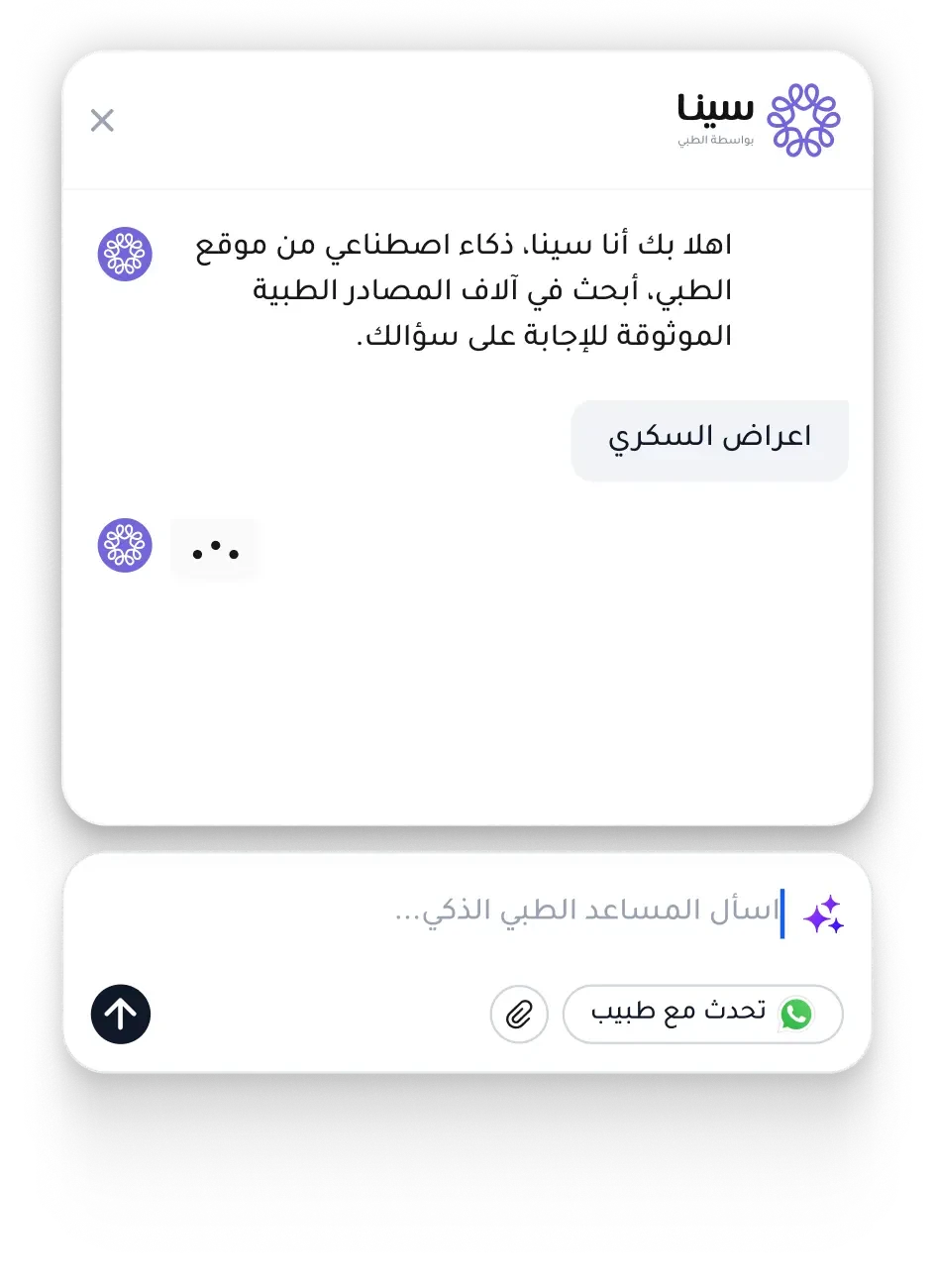
The widget became fully interactive in place. The conversation happens on the article page — ask a question, get an answer, stay where you are.
Two decisions carried this version.
The AI opens by summarizing what you are reading. Not "how can I help?" — an empty prompt asks the user to do the work of starting. The summary means the conversation has already started, and it is about the thing on screen.
A "talk to a doctor" button sits in the same input row as the send arrow. This is the decision I would defend hardest. Putting human escalation directly beside the AI's input is an AI product admitting its limits in the place where users are most likely to hit them — and it is also the business case. Engagement is a soft metric; a consultation is revenue. The widget went from traffic router to acquisition surface.
The layout is Arabic-native throughout rather than a mirrored English one: reading order, the send arrow's direction, numerals and date formats all follow RTL instead of being flipped after the fact.
Outcome
Engagement roughly doubled after the interactive version shipped.
The more useful finding is what the three versions establish together. Each one moved the AI closer to the user's context, and each move paid. The pattern argues that the failure of most AI entry points is not the model — it is asking people to leave the thing they came for.
Reflection
Version 2 should have been version 1. The page-aware tag took a fraction of the effort of the full interactive build, and it was the change that made the widget credible. I spent a version proving that a button can send you somewhere before asking whether the user wanted to go.
Recent work
The latest projects, newest first.