Subscription Exit Flow
Altibbi's cancellation flow was a button and a survey. I rebuilt it as a ladder of interventions ordered by cost — the first rung alone kept 22% more subscribers.

Most people cancelling a subscription have not evaluated it. They have stopped thinking about it. The flow I inherited at Altibbi took that silence as a decision and processed it.
Role: Product designer — inherited an existing cancellation flow, redesigned the surrounding experience and built the interception sequence.
Context
Altibbi is the largest telehealth platform in MENA. A subscription buys doctor consultations — instant calls, chats, file sharing with a doctor — billed monthly. Subscriptions carry the business, so the exit is one of the highest-leverage screens in the product.
What I was handed
A subscription information page, a cancel button, and a reason survey.
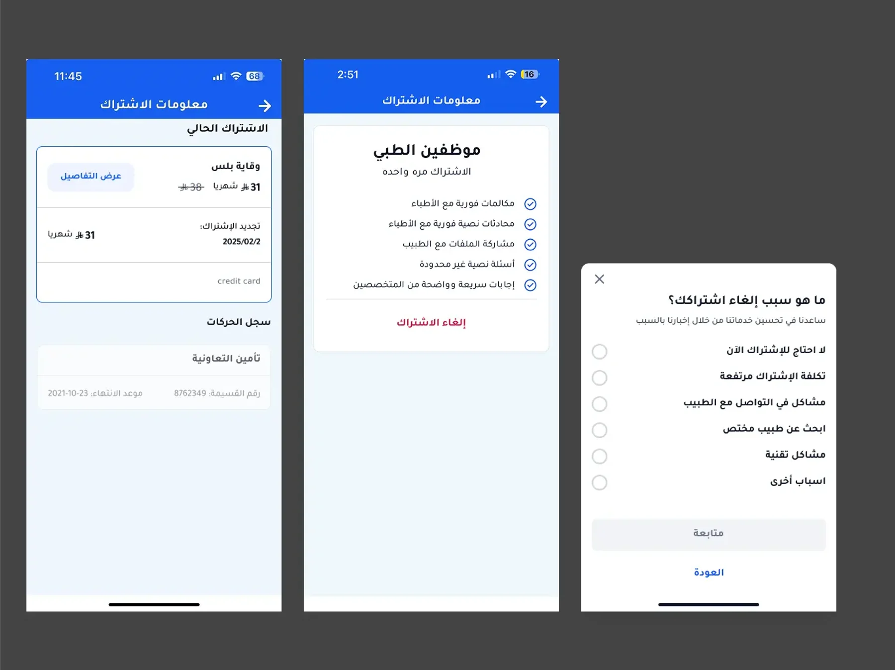
The survey was the only retention thinking in the flow, and it ran after the decision. It collected data about people already leaving instead of giving anyone a reason to stay. Between pressing cancel and being cancelled there was nothing — no information, no alternative, no pause.
The subscription page itself had the same gap. It listed what the plan included: unlimited chats, instant calls, file sharing. A feature list tells you what you bought. It does not tell you what you got.
The insight
Users were cancelling with consultations still unused.
They had paid for the month, used one or two, and were closing an account that still had value sitting in it. Not a pricing objection and not a quality objection — they had simply lost track of what was in the box. The product's value accumulates quietly, and quiet value is invisible at exactly the moment it is being judged.
They were not rejecting the subscription. They had forgotten what it contained.
The design
I rebuilt the exit as a ladder — a sequence of interceptions ordered from cheapest to most expensive for the business, each one addressing a different reason for leaving.
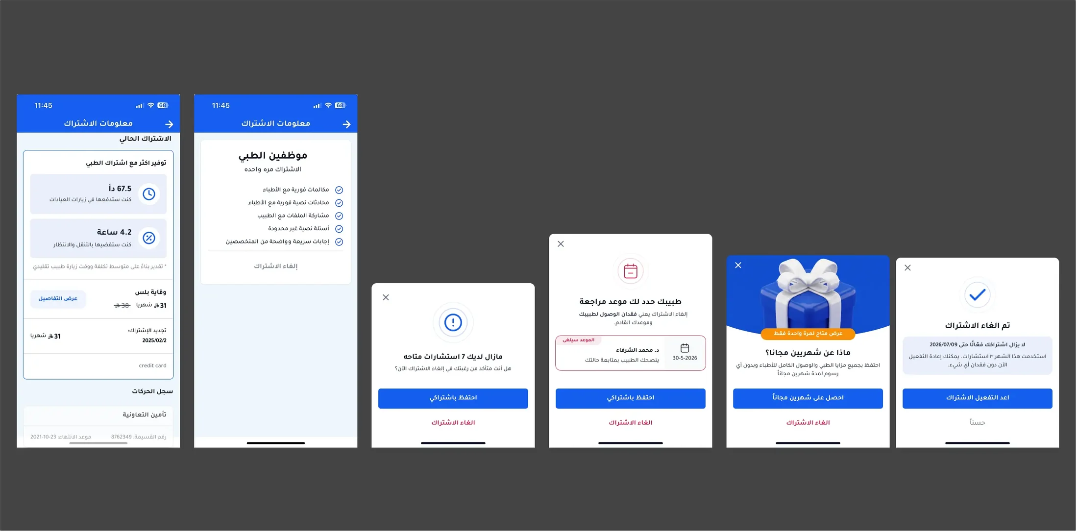
Rung zero: make the value visible before anyone reaches the exit. I redesigned the subscription page to lead with what the plan had returned, in the two currencies people actually feel — money and time. It shows what those consultations would have cost as clinic visits and the hours saved in travel and waiting, marked clearly as an estimate against a typical visit. Below that sits the plan, the price, the renewal date. The feature list moved down. It is not there to argue; it is there to remind.
Rung one: unused consultations. Pressing cancel opens with what is still available — seven consultations, unused, paid for. Then a plain question: are you sure you want to cancel now? No offer, no discount, nothing given away. Just returning information the user already owned. This step alone increased subscription retention by 22%, which makes it by a wide margin the cheapest retention mechanism in the product.
Rung two: the upcoming appointment. If the user has a scheduled follow-up, that comes next: their doctor's name, the date, and what cancelling costs them — access to that doctor and that appointment. This turned out to be the single strongest lever in the flow. It works because it is not an argument about a subscription; it is a specific commitment with a specific person, and it makes the abstract concrete at exactly the right moment.
Rung three: the salvage offer. Only after both informational rungs fail does anything get given away — two months free, framed as a one-time offer. It sits last on purpose. An offer made first teaches users that threatening to cancel lowers the price, and it spends margin on people who would have stayed for a reminder.
The exit itself stays open. Confirming does not slam a door: the subscription runs to the end of the paid period, the screen states the exact date, notes what was used this month, and offers one-tap reactivation with nothing lost. Someone leaving in a thin month can return in a better one without the friction of a stranger.
The whole flow is Arabic-native RTL — reading order, numerals, dates and the placement of the primary action follow right-to-left conventions rather than being mirrored after the fact. In every modal, staying is the filled primary button and cancelling stays visible as text. Deflection, not obstruction: the exit is always one tap away, and never hidden.
On prior art
Churn deflection is not a novel pattern — subscription products from streaming services to creative software run a version of it, and I read about the approach before designing this. What is not transferable is the sequence. Those products deflect with discounts because a discount is the only lever they have. Altibbi has unused consultations and a scheduled doctor, which are stronger than money and cost nothing, so the ordering inverts: information first, margin last.
Outcome
22% more subscribers retained from the unused-consultations step alone — the first rung, and the one that gives nothing away.
The appointment interception proved the strongest individual save. And the structural change matters as much as the numbers: cancellation stopped being one irreversible event and became a sequence of reversible states, each measured separately. The flow shipped alongside subscription funnel A/B experimentation, and a pause option shipped as related work.
Recent work
The latest projects, newest first.