Two screens instead of four
Tiriparo books a mechanic to come to your car. The booking flow started at four screens and shipped at two — one merged, one deleted, and a customizable profile argued out of scope.
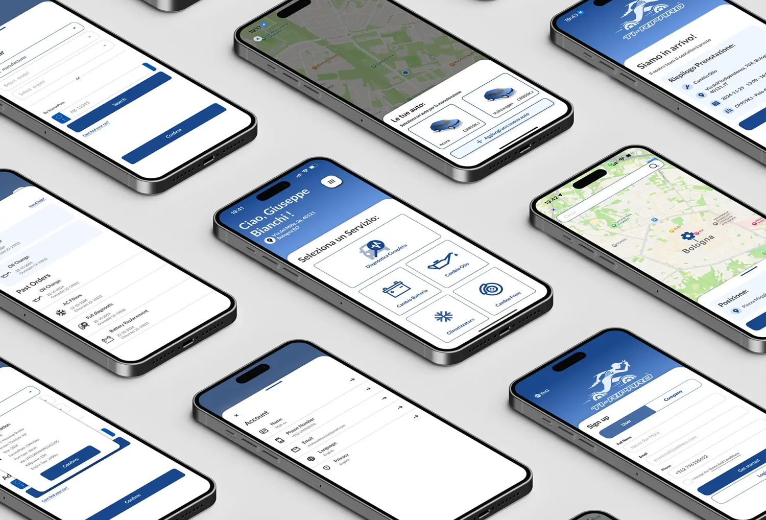
Tiriparo is a home mechanic service: instead of driving a broken car to a garage, the mechanic comes to the car. I designed the wireframes and the core booking flow as client work, and the app launched.
Role: UI/UX Designer — wireframes and main user flow. Tools: Figma, Photoshop, Illustrator.
The problem with the original flow
Booking took four screens: pick a service, describe the problem, pick which car, then set a location and confirm.
Every one of those steps is a reasonable question. Asked in sequence, they turn a person with a car that will not start into a person filling in a form. The context matters — this product is used by someone stranded, often at the roadside, often stressed. Four screens is a lot of taps for someone standing next to a car that will not move.
The flow was correct and the situation was urgent, and nobody had reconciled the two.
What I merged
Service selection and problem description became one screen. Choosing "Full Diagnostics" and typing what is wrong are the same thought — the user is describing their situation once, not twice. Splitting them across screens made the app ask a question it had already been answered.
The merged screen keeps the service grid visible and opens the description inline, so the user sees what they picked while they explain it. One screen, one thought.
What I deleted
The car selection screen came out of booking entirely.
A car is not a booking decision. It is a fact about the account — it does not change between one repair and the next. Asking for it mid-flow treats a constant as a variable, and it interrupts someone at the exact moment they are trying to describe an emergency.
So cars moved to the account. They sit on the home screen, they are added once, and adding one takes a licence plate: type the plate, and the make, model, year and engine come back. The user does not have to know their engine size while standing on the hard shoulder.
That leaves booking with what actually varies per job: what is wrong, and where and when to fix it. Location, date and time, then a summary and confirm.
The scope argument
The client wanted a full user profile with the kind of customization you find in social apps — a personalized space to make your own.
I argued against it. The product has one job: get a car fixed. A profile that invites decoration adds surface area to maintain, pulls attention away from the flow that generates revenue, and answers a need nobody has while their car is broken. Nobody customizes an avatar while waiting for a mechanic.
The profile stayed functional: your cars, your orders, your account. That decision is the reason the booking flow could shrink — a product that knows what it is for has fewer screens to defend.
What I would do next
The flow shipped, and the number I never got to see is where people abandon the second screen. Location, date and time all live there, and scheduling is the step most likely to stall someone who wants help now. If I picked this up again, I would test an immediate option — the soonest available mechanic, one tap, no calendar — against the current scheduler. Compression got the flow to two screens. The next gain is in making one of them optional.
Recent work
The latest projects, newest first.